


1995: The Year US Open Gear Peaked
The USTA should look to 30 years ago and bring some edge and variety back to US Open merch

Produced by American Needle and available in a myriad of colors and material choices, the US Open dad hats can be seen all over New York. Tech bros, downtown kids, Upper West Side pensioners, and everyone in between is wearing them to signal they’ve been to America’s Grand Slam. It’s a democratic hat and its ubiquity tracks with the seemingly unbounded rise in popularity in the sport amongst people of all different walks of life.
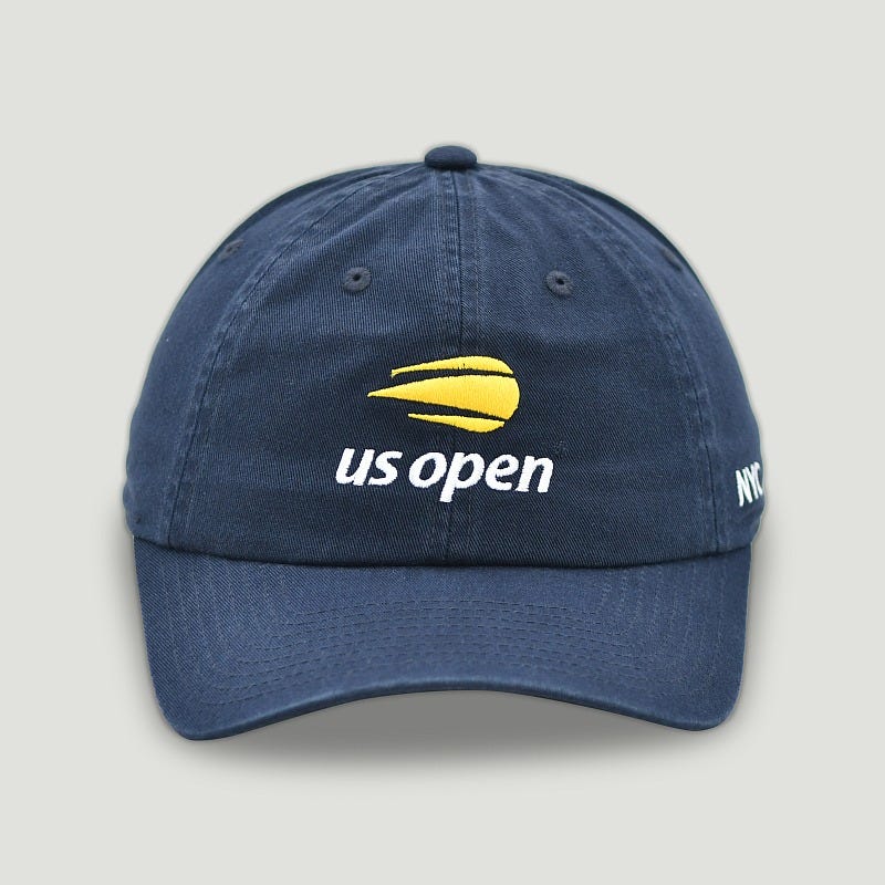
The hat typically will have the updated US Open flaming ball logo and the accompanying year - it’s simple and inoffensive. It’s not a bad design, but it just feels perhaps a little too safe and even homogeneous. Since they updated the flaming ball logo in 2018, there has been little design innovation and little effort to capture what makes going to the US Open great. It feels like an afterthought. Look at this hat from 2019 - it is essentially the same design as the hat above.
As a vintage dealer and newish tennis fan, I’m always looking to source US Open gear from the different decades. The earliest merch I have found is from 1978 (the first year the Open was held at the National Tennis Center) and there is great merch up until the early aughts. If I had to choose one period to be the best, I would say the 1990s - where each year’s merch output felt different. And within that decade, there is one year that stands out amongst all the others: 1995.
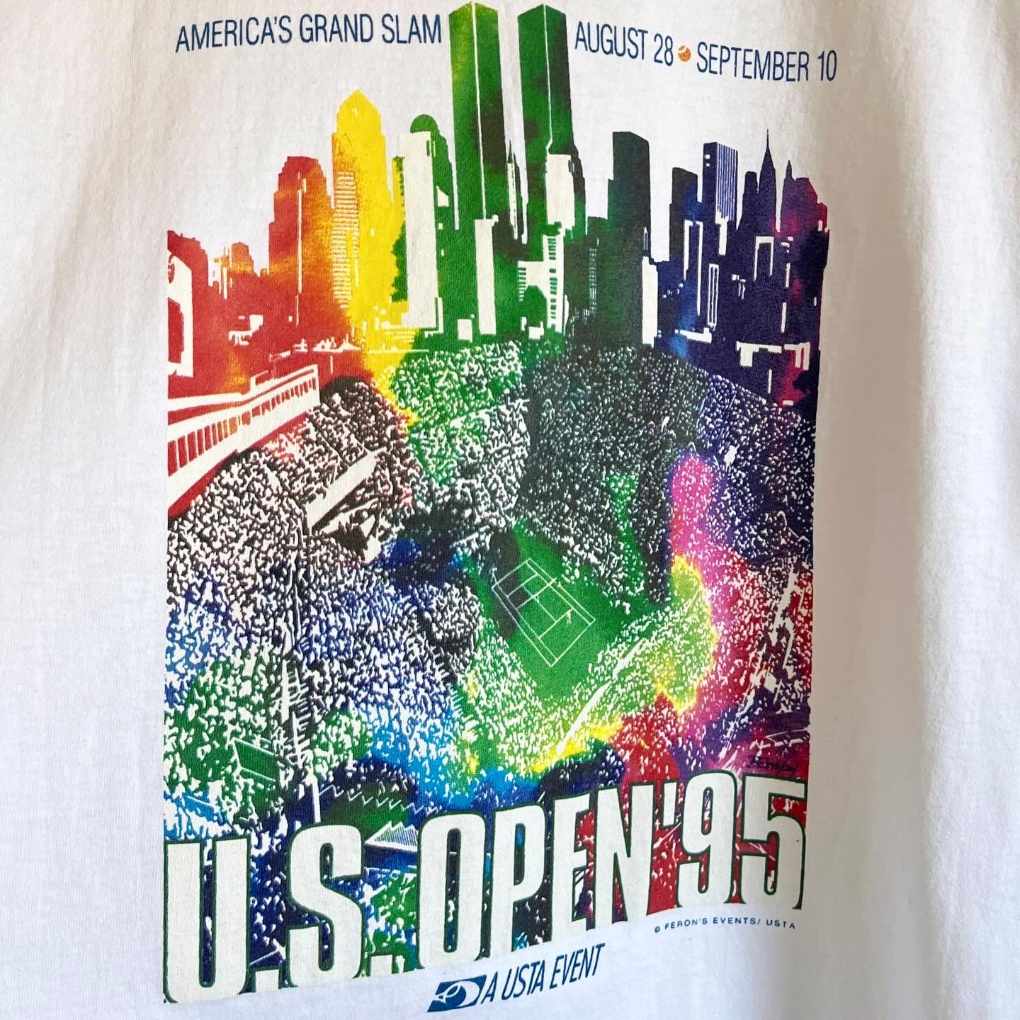
Based on what I see and find out there, 1995’s merch offered the most variety and felt like they were having the most fun. There is truly something for everyone and the designs from this year feel the most timeless than other years. Often with vintage graphics, especially the 80s and 90s, they can feel like time capsules, but also feel dated. But 1995, in my opinion, had the most designs that were wearable 10, 20, and 30 years after. The psychedelic graphic above, for example, could have come out in the 2010s during the tie-dye craze or now with jam band music having its widest audience.
The variety is key. In 1995, they were simple logo hats just like the current offering. But unlike today, it’s not just the logo hats. There were more options - funner options, more thoughtful options, or dare I say freakier options. There were strapbacks with great wash treatments like this one produced by American Needle (same manufacturer as the current hats):
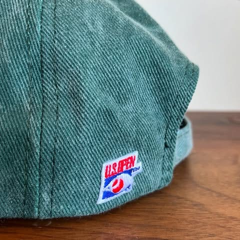
Or snapbacks with embroidery that looks like paint splatter:

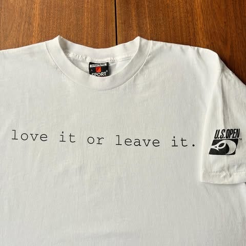
The ‘love it or leave it.’ shirt is probably the wildest one I have found. Kind of a pun, debatably MAGA-coded, feels right at home in 2000s Streetwear. Wear it with some 2009 Supreme.
Seriously, there was something for everyone:

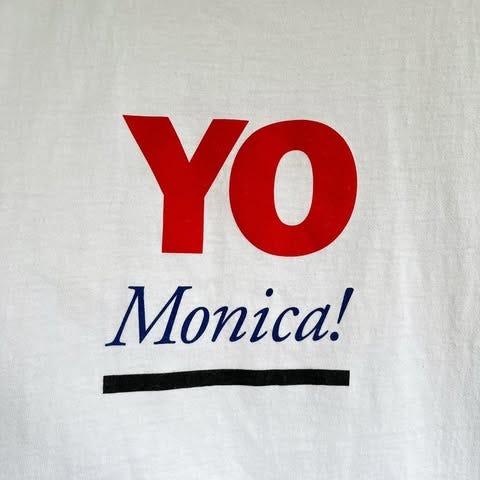
Hey, I’m serving here! Brands like Nike and Yonex tapped into the energy and attitude of a New Yorker with some of their US Open offerings (see below). The tournament's merch should evoke NYC and the way the current merch looks, it feels like it could have taken place in Cincinnati (no shade). By evoking the stereotypical New York tough guy and the choice interjection of the locals, YO!, Nike and Yonex highlight the fact that the US Open is uniquely a New York experience.

There are many t-shirt graphics through the years that evoke the Big Apple by including the skyline. This is great, but I really appreciate the specific, hyperlocal mention of Flushing Meadows, for example on this t-shirt by Nike below:

I have only personally been to the US Open a couple times, but when I am there it reminds of the first experience of going to a music festival. Especially this past year. All these different kinds of people are there together. They have different interests and lifestyles that shape their perspective and appreciation of tennis and I would love to see the merch reflect that more.